Need Your Vote: Logo Design + Palette
The Best Leadership Newsletter Ever is growing. Time for a new logo and new color palette. And you need to help me figure out the direction.
LOGO DESIGN
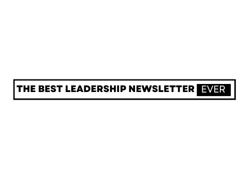
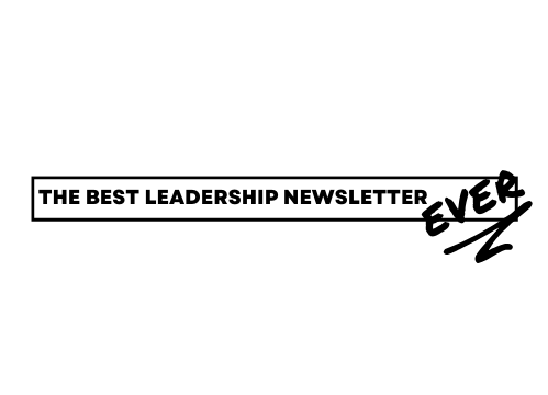
Please look at these logos, then answer the poll about which design you like best:
OPTION A.
OPTION B.
OPTION C.
OPTION D.
OPTION E.
Have additional thoughts? Email me.
COLOR PALETTE
Please look at these color palettes, then answer the poll about which color palette you like best.
OPTION 1.
OPTION 2.
OPTION 3.
OPTION 4.
Have additional thoughts? Email me.
Thank you!!!


You're the best EVER
I seem to be in the majority! We have a quorum.